Monday, June 23, 2008

Vignettes - and adding a little D*R*A*M*A


Today I am going to show you how to add a simple vignette to you images in PSE6.

First lets open an image, like this one of Princess-in-Training. Isn’t she cute (everyone say yes!) I just love that look on her face!

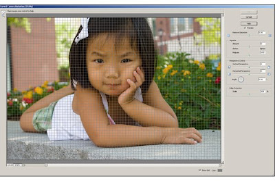
Next, we are going to go into filters and choose Correct Camera Distortion.

Your screen will now look like this:

On the right side you will see a slider for creating a vignette. Slide it toward the left to achieve the amount of vignette you want in your image. I like to turn off the Grid at the bottom of the page and then I can see how much I am sliding down my amount and midpoint.

Now click OK and you are done!

Like I told you easy – a vignette to add dept to our image!

I like it just fine – but that is about it. Still kind of flat for me. I like something a little more dramatic. So let’s add a little drama!

Using my Shape Tool I am going to drag a white rectangle over the image. Notice that I have white as my foreground color and black as my background.

You then repeat the steps to create a vignette – but first you need to simplify the shape.

Create another vignette with the slider.


Click okay when you are satisfied with your vignette.

Now for the drama – we are going to blend the vignette to the image of Princess-in-Training!

On the right side of your screen, right about the Shape in the Layers palate you will see a menu drop down that say normal. Click on that as I have:

Now you want to select Multiply – make sure that you have the Shape layer highlighted in the Layer Palate.

Merge the layers together and wow! Here is my final image :D

This is just a spring board to enhance your images her are some variations I did just to show you the possibilities!

Yes, she is defiantly a drama queen :D

Organization - A must for the digi scrapper :D


One of the most frequently asked questions I get is about organization. I will now try to welcome you into the world of the neuritic. Just remember that you asked for it.

My organization is really simple - I organize all my images by date. When I burn them to a DVD, I write down where and what we did. For me staying organized means being able to get what I want quickly - not having my computer slow me down because I have everything and the kitchen sink on it :D

I shoot Raw Files and they are - in the word of Will Ferrel in Elf - ginormous! So - to accommodate my large file I have 2 hard drives on my computer. My C drive is where my working programs are, for example Photoshop, Word, and Lightroom. My D drive is where stuff that I am currently editing is located and scraping materials that I am currently "in love with". I have two external hard drives and one is for storage of all my scraping materials and the other is for everything from a paper on The Hague Convention on Inter-country Adoption and USPTO stuff to images that have not been burned to a DVD (I now burn DVD's instead of CD's because of my file size) External Drive #2 is all my scraping supplies and that is the only thing that goes on that external. I also have all my images backed up on DVD's by the month and year. Once they are on DVD and I delete them from my external and internal drives. It works for me. I also want to encourage you to delete the compressed file that you receive for the shops where you buys your supplies - once you extract the file there is no reason to really keep the zip file. I burn them to a DVD as a back up and then they are gone.

As for my scraping materials - I have a three ring binder and I print out the contact sheets that come with most kits. I print them in color and then place them in the binder by designer and boutique. I do this so that when I am away and I want to prep a layout - I can pull out my three ring binder and work. Also - this is a great source when I am looking for an embellishment and I know that the one I want is by Syndee Nuckles from Scrap Girls - just as an example. I can start there and find what I want. It beats going through the hundreds of files I have accumulated in a short time since I started digi scraping.

For most folk I suggest two external drives. One for images and another for your scraping materials. I go back and forth between my laptop and desktop, so having two externals makes it easy to keep working. Also - Sending your scrapping materials to an external hard drive will keep your computer "clean" and working at optimal speed.

One more tip - I have a file for Prince Charming's Scrapbook and another file for Princess-in-Training's book. If you were to open that file you would see a file for each month in 2008. I save all my LO's in these files. Once I am sure that a file is perfect and I am not going to do anything else to it - I delete the PSD file. I only save and burn to DVD's the jpg. flies. Once a month I burn to the DVD the image and a slide show set to music.

Oh - BTW - I de-frag everyday - my computer is set up to do it automatically - this is just good maintenance :D

So that is how I stay organized ~ did it help? If you have a tip to share on how you stay organized - leave a comment and share it with everyone :D

Wednesday, May 14, 2008

Creating Chipboard Elements with Brushes

So you bought a kit – love all the doodles and swirls, the papers are perfect for the image you just shot, and last but not least the creative juices are flowing! Great – Wrong! The great swirl is in a stripe that looks horrific next to your daughter beautiful new…

Okay, maybe I am getting to personal, but I love having the ability to take a brush of a swirl and turn them into exactly what I want in the blink of an eye – well – a few click of a mouse :D

Today, we are going to take a brush from Rhonna Farrer and apply some papers and then add a stroke to edge it to give us an element that looks like chipboard. I love Rhonna Farrer’s swirls and I thin that they are well worth investing in for your digital toolbox and after this I hope that you will see how easy using brushes is. I have all my brushes installed and if you are having trouble installing brushes then shoot me an e-mail. Please don’t just leave me a comment because so many times I try to answer your questions and I get that “no reply” e-mail.

So – let open those brushes :D
I start by opening a new page. I happen to like working with the white background – but that is just a preference of mine and I will delete it at the end.

I am going to select my brush from the tool sidebar and it will give me my options at the top of my workspace.As you can see – I use the drop down menu to select what brush collection I want to use and then it will expand so that I can chose the brush I want.I need to do one more thing before I actually use my brush and that is create a new layer. Remember I told you that I was going to delete my background at the end; I need to create this layer so that I don’t delete my project.So here is a quick look at my screen Nothing to exciting – let’s fix that :D The first thing that we are going to do is just positin the brush on the page with our mouse and then give it a single left click. Make sure that you are working on Layer 1.
I don’t know what size this is going to be in my final layout so I am going to err on the big size and then shrink it to fit when I go to design my layout.The next thing I need to do is select a piece of paper and I am going to use black polka dots from Shabby Miss Jenn’s Gracie’s Garden for this. I have the two windows side by side.And I am simply going to drag and drop my black paper onto my brush design. When you do this you should not see your design. I have played with the opacity for the purpose of the tutroial.I am going to close my paper and expand my project. I want the dots to be smaller so I am going to shrink my paper to where it is just barely covers my brush design.

and now I can cut my design out from my brush by using the Ctrl G shortcut.


Viola ~ we have used a brush to create a perfectly matched element for your layout!

I am not quite done – I want it to look like chipboard so I am first going to add a stroke of white to outline the design. To do this I first going to delete my white background layer and flatten my image (this step is in another tutorial or e-mail me for help). I am going to use the stroke command found in the edit tab at the top of the screen.
When you select this you will get a window that asks you to select the pixel width of your outline and the color. For this I am using a pixel width of 5 and a white outline. FYI – when I outline pictures I use a pixel width of 20 to 35.Here is what we now have and we are almost done:
Remember I said I wanted to create a chipboard look; we do that by using the bevel feature in the Effect palate.I like the Simple Embossed bevel look so I pick that option and hit apply. I went ahead and added the drop shadow so that you could see the cardstock effect.

What do you think now? Easy huh :D


Please let me know if this tutorial was helpful and remember to e-mail me if you have questions – I’d love to help :D


Saturday, April 26, 2008

STOP The Presses!

Okay - after getting several e-mails stating that the tutorial on paper curling was Awesome for some but not for other, I suggested that a few of you call me and try to muddle our way through! Well, call number one produce fruit, but call number two (today) produced FRUSTRATION! In the process of almost giving up - kick myself for not thinking of this earlier - I asked my friend if she was using XP or Vista. OMG - that was the problem! My tutorial is written for XP and even thought I am getting a new computer in a few weeks, I will not be using VISTA. Thanks to Google - we found out that installing Actions in PSE6 is different in XP and Vista. Why did Adobe have to make this so hard! So - if you are still having problems - e-mail me and I will send you what I have to make it possible for you to upload if you are using Vista :D

BTW - thanks for all the suggestions on new Tutorials! I promise a new one next week - brushes is almost done and I am combining that with clipping masks!

Happy Scrappin'

Friday, April 18, 2008

Word Art

So sorry that this took me so long to get up. It has been quite a week here at the castle.

Word Art was so intimidating to me – how could I possibly create such wonderful creations. Well, have no fear, creating beautiful word art is the crowning jewel in a beautiful layout and SO SO SO easy. I hope that everyone is getting comfortable working with layers because that is really the only trick to word art - working with lots and lots of layers.

The first thing I do is write out what I want. For this Tutorial I am doing a smug little picture of Prince Charming and Princess-in-Training out in a field. Here are my words:

You mimic everything HE does

Right down to the Attitude.

I am going to now open a 5x7 300ppi new page. I am also going to keep the image that I want to use open in my project bin so that it can help dictate what fonts I use.

When I wrote my text I circled certain letters and words that I wanted to distinguish.

YOU

Mimic

HE

Attitude – 8 letters = 8 layers

I am going to get those words going first and I am actually going to do Attitude because I am going to use a Rhonna Farrer Font in my brushes to achieve the look. I am going to put each letter on a separate layer so that I can move and position them just the way I want. Take a look:

The short cut for opening up a new layer is ctrl – shift - N

I am going to do this 8 times and then after we are done creating the word Attitude we will merge the layers together. In the following image you will see that I have the word Attitude done with each letter on separate layer.

Now that I have all 8 letters on individual layers I can resize them and move them to where I want them. Notice that in the next image I moved the letter A and resized the letter and PSE6 is just waiting from me to hit the big green check mark to go on.

Once I have moved all the letters into place -

I 'm done with this word. I am going to delete my Background Layer and merge the layers together.

Open up another 5X7 300ppi new window and drag and drop the word Attitude into the new 5X7 - DO NOT CLOSE THE WORKING WINDOW THAT YOU USED TO CREATE THE WORD ATTITUDE. You might need to go back and redo the word and that is the beauty of the undo key :D

Now that start adding words and each word is an individual layer. I also start at a pt size of 72. I will show you in just a minute how to go back and edit the text once we get everything in the page.

This is what my screen now looks like – YIKES!

That is not very pretty lets start editing. To edit text that is already in your layout just make sure that you are in the text tool and right click with your mouse on the text that you want to edit.

When I select edit type I can now go back and play with the word. Notice how my cursor appears in the middle of the word down.

So I changed the font from Be Aggressive to all the words except YOU and HE to 2Peas GG Mix and the pt size from 72 to 30. Here is what my word art is looking like:

Better? Yes – but still not there. Let’s keep going and focus on YOU.

Notice that I deleted the Y and changed the OU font and point size. I am going to open a New Layer for the Letter Y. I also need to move the OU in closer to the word Mimic. I want the Y to reflect my little Princess so I am going with a rather girly font. Take a look:


Now it works with the image I am using. I decided not to change HE because in the final layout it works and this is a very busy word art. So – once again I will delete my background and merge my layers. I now check to make sure that my word art and photo work by dropping them into a new 12x12 layout – here is a sneak peak at my current page!


Have fun making word art today! I need to get this page finished :D

Saturday, April 12, 2008

Slideshows in PSE6

***If you would like to view the slideshow that was created from this tutorial please click here.


Sometimes it is just good to start at the beginning. I was asked by a special friend to do a tutorial on how to make a slideshow in PSE6 and since the Royal Scribe brought her BEAUTIFUL daughters over for me to photograph today, I decided that I would write this tutorial. I love slide shows and this is one of the items included in my photography sessions, but I love how they can enhance your scrapbook. When you get your book printed, and that I will talk about in another post, I would suggest burning a DVD of special slideshow and movies and making a library card jacket in the book for the DVD. Someday, when you sit down and reminisce, you won’t have to go looking for the video!

Oh- BTW – We have been under a terrible drought where we live and so I know how bad the yard and plants look – I am so embarrassed you are seeing this! I am using conservation techniques so I can’t transplant my plants into pots just yet ;=(

So – without further ado – Let’s make a slideshow in PSE6!

From the opening window in PSE6 choose the create icon.

When it opens, it will look like you are in organizer, but on the right side of the screen it will ask you want do you want to create? Click on Slideshow.

You will then have a window pop up with pre-set features for the slideshow – I generally ignore these because I am going to set my slideshow to music I don’t know how long my slides and transitions need to be yet. So just hit OK.

Notice that I did not pick any slides to be in my slideshow from the organizer window. Before I start a project – actually when I was editing and add my artistic flare – I was saving the images for the slideshow into a separate folder. So when I open up my work window it will be empty.

Now I am ready to add my images. See the BIG LIME GREEN + sign at the top – click on that.

and a dialog box appears:

and I can retrieve the images I want to use. Since I took the time to organize my images earlier, I can use the shift key and select all the images in this folder.

You will now see that all of my images appear at the bottom Slide Palate. You can also use the “click here to add photos” feature in the Slide Palate, but I find that it is easier to organize and use the +MEDIA feature. Both work.

Here is what my screen now looks like:

The first thing I have to do is find the title slide I created in PSE6’s Edit Workspace. For this show, I added titles and did all the work in the Edit Area. So let move the slide around by dragging and dropping them where we want them.

Now my title is first and the slides are in the order I want them. I want to add music to the Slideshow so I am going to click on the “Click here to add audio to Your Slide Show in the Slide Plate. A dialog box appears that contains my music in it and I navigate to the song I want.

Once you find your song and open it, PSE6 lays the track to your slideshow. The default feature will cause you song to repeat at the end of the show based on the time you select for your slides and transitions. I have a lot of images and like them to move along, so I use the feature found right above the Slide Palate on the left side that says “fit slides to audio”. See what happens to the time of my slides:

To save your slideshow click on the Output tab and save your slideshow.

So – you have now created a simple slideshow that you can save and load to your blog or burn to a DVD.